A FULL LIVING
Second shooter for food blogger duo, A Full Living, focusing on healthier-for-you (while still indulgent) low carb, low sugar and keto-friendly recipes without sacrificing flavor. Shot dessert and drinks while main photographer edited.


TINYBOT VINYL REBRANDING
Conducted a rebranding project for TinyBot Vinyl, a car vinyl wrapping company. The brand wanted to update their logo as well as construct a cohesive branding identity.
ISSUE: TinyBot Vinyl did not feel like the original logo represented their company culture very well. Most of the staff felt that the burgundy color of the original logo was 'too dark' and the chosen typeface could be 'cleaner.' According to user input, some customers wanted a less 'childish' and a more 'professional' logo to represent on their vehicle, with a vinyl sticker.
“I feel like our logo is pretty dull and desaturated. We want a logo that would represent how colorful our culture and service actually are.”
- Harry Kim, Co-Owner TinyBot Vinyl
GOALS:
Update current logo mark and type mark
Provide a cohesive and concrete brand identity system
Introduce a more vibrant brand color palette while maintaining visionary brand goals

Original TinyBot Vinyl Logo


Drafting Process focusing on a street culture influence and maintaining a robotic and “tiny” appearance


Logo Update decision journey.


SPOONERS
Spooners is a restaurant located in La Verne, California focusing on Korean cuisine. The project at hand was to redesign the menu while brand was going under rebranding. Helped in the construction of new brand logo and merch design.

Updated to-go menu


Employee T-Shirt Mock-up Design

SHEISA EVENTS
Branding project with Sheisa Events, a wedding and event coordinating business. Directed the project in logo creation and brand identity guide.
ISSUE: The founders of Sheisa Events identified that their logo was noticeably outdated. With growth and new services in mind, they wanted to update their logo for a modern feel to signal their expansion.
“The Sheisa name is meant to be a way to empower women to celebrate their biggest moments and to incorporate them into our brand so they are also part of our story - She is a bride for weddings, birthday girl for birthdays, fiancé for engagements, expectant mother for baby showers, or boss for professional milestone celebrations.'“
- Sheisa Events team
GOALS:
Update logo for modern feel
Bohemian, classy look
Branding guide for consistent look

Original Logo

Floral Assets for logo variations and marketing material

Updated Logo Mark and Type Logo


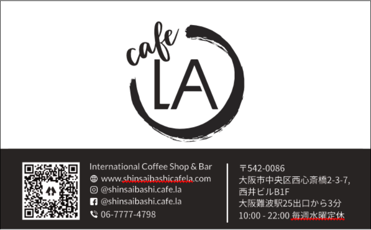
CAFE LA
Cafe LA is a American-influenced coffee bar located in Shinsaibashi, Osaka, Japan. The brand wanted to update the logo and rebrand themselves to give off a more sophisticated and inviting presence. Directed the project in constructing a new brand identity and marketing campaign for current customer audience via social media imagery.
ISSUE: The founder did not have a strong design foundation in mind for the brand. Started creating on a “needs” basis and started to feel overwhelmed with the inconsistency of the branding.
“I don’t really know what I was aiming for when it comes to the Logo. I just needed one to open shop and that was the best I could make at the time.“
- Erik Chen, CAFE LA Founder
GOALS:
Update logo for “Coffee” and “Bar” audience
Create a consistent branding identity that represents the attributes of the founder and Los Angeles
Give a imagery structure guide for social media presence.
Original Logo


Business Cards

