
BRAND:
Sheisa Events
Start-up wedding coordination business
Project Duration:
February 2022 | 1 Month
PROJECT ROLE:
CREATIVE DIRECTOR
DESIGNER
PROJECT DETAILS:
DISCOVERY & RESEARCH
LOGO REDESIGN
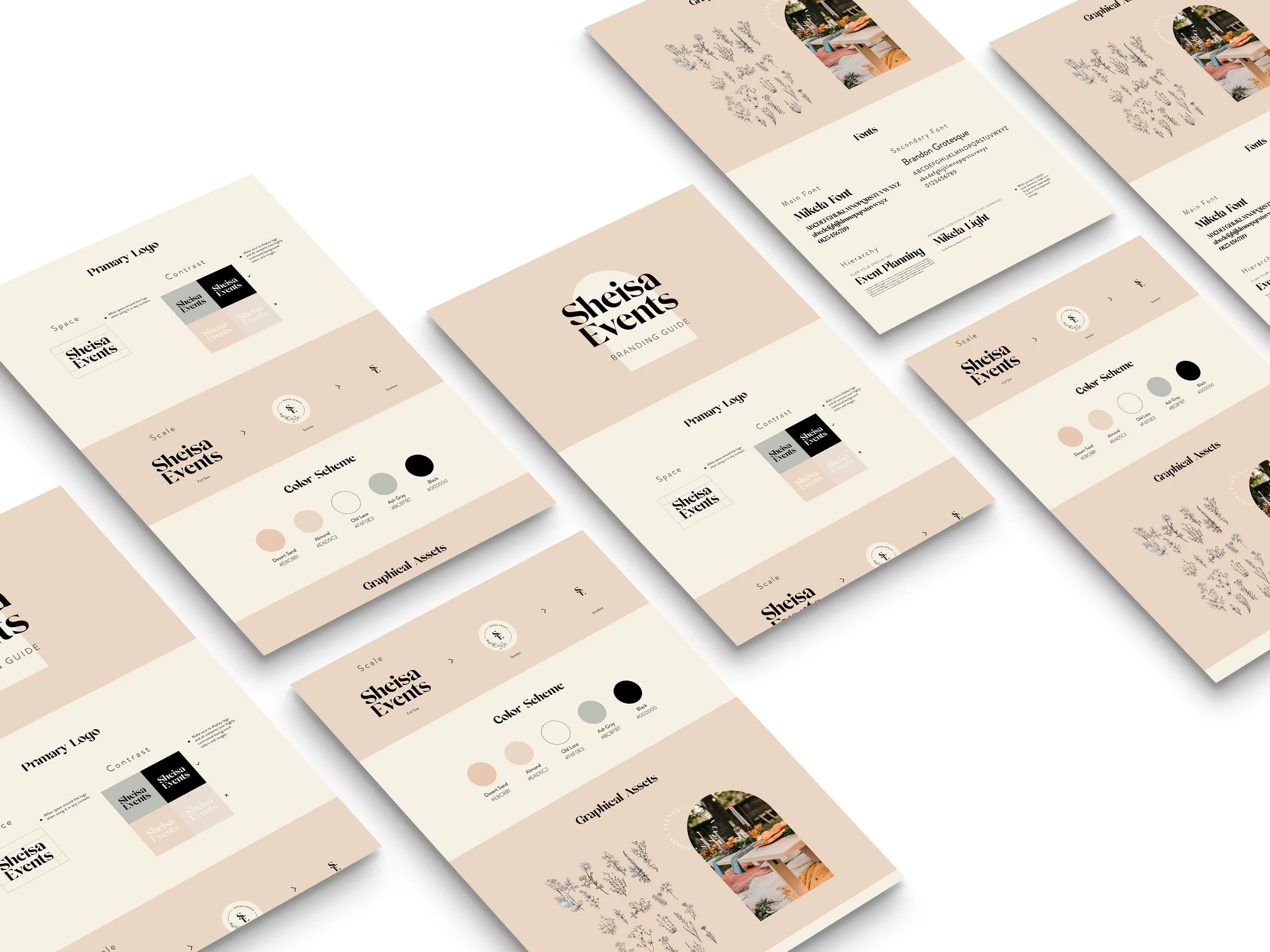
BRAND STYLE GUIDE
Challenge:
Redesign the brand logo mark and establish a cohesive brand design system for future collateral and branding purposes. The brand did not have any assets officially created and was in need of quick branding assets.
Outcome:
The brand’s visual presence became cohesive and clients were able to recognize the branding based on the color palette and logo. Shesia Events was able to step further into their business with an official branding identity.
strategy & approach:
How Sheisa became. “she is a _____”
From a meticulous discovery sessions, we discovered the origins of Sheisa Events being a partnership between three individual event coordinators who have a passion for weddings. We understood that they wanted to cater toward an airy wedding style and bohemian atmosphere. With that said, they wanted their brand identity to reflect the type of coordination expertise. The brand also wanted to empower the fragility and elegance of the feminine soul by highlighting the “her” through the phrase “She is a ______.”
defining the brand
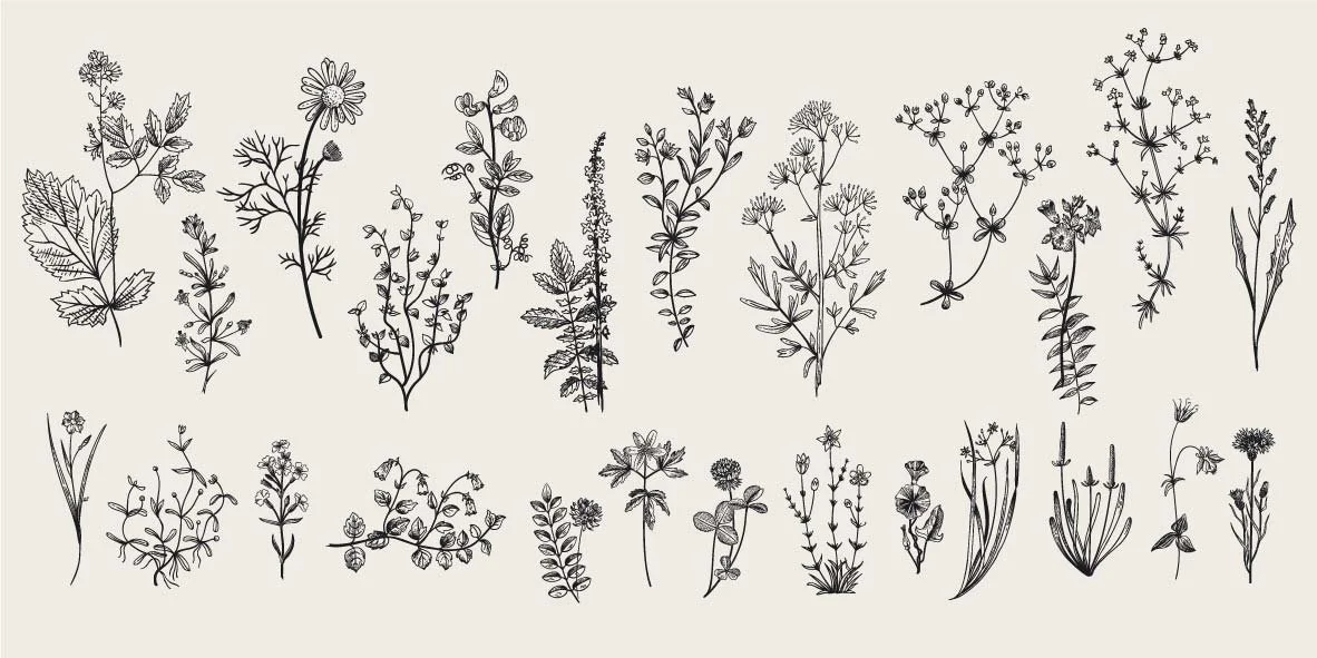
While interviewing the three owners of Sheisa Events, it was established that the brand needed to include elements that reflect the bohemian narrative. The use of floral accents came up often during discussion, which led us to include a variety of florals to accentuate the name of Sheisa. Further, the color palette needed to reflect and compliment the fragility and elegance that was focused upon during the discovery phase.
Understanding the user
Being a wedding coordination business, the brand wanted to aim toward the feminine appeal toward event designing. The three owners were well versed in designing a bohemian style event and wanted that image to attract customers who are also intrigued by bohemian visuals. With a muted color palette and a repeated use of floral elements, the brand wanted to empower, celebrate, and congratulate the female achievements. This lead to a brand design system that would make the female audience take a double-look and open up conversation.

Brand refresh:
stopping to smell the roses of sheisa
The previous logo for Sheisa Events was created out of urgency and did not allow ample time for revisions and feedback. With the owners still leaning toward their initial idea, we decided to revamp and modernize the logo to compliment the rest of their new branding elements. We used the floral elements to help accentuate the SE for Sheisa Events while use an intertwining lettering to give off an element taste to the logo mark.
branding application:
She is a elegant queen.
The brand needed to reflect a bohemian world in that celebrate and empowers the achievements of the female counterpart. A brand style guide was created to help the Sheisa internal team to continue to create marketing material with a cohesive brand identit.

what was the outcome?
Since this rebranding project, the booking rate by Sheisa has increased by 200%. With an quick increase in wedding coordination inquiries and bookings for the 2022 and upcoming 2023 year, the rebranding has become a success and established a proper visual to match the ambiance of the brand’s work.
